Embed your data
Default baselines
This section assumes you have a .scool file. If you need to generate one from your own data, refer to the previous section.
We can provide this file and the reference file to the scloop embed command to run the embedding analysis.
While you do have full control over which embedding methods to run, we also provide useful defaults for getting started by sweeping across a range of reasonable baseline methods.
Providing no extra arguments will run 12 of the most common baseline procedures (combining preprocessing with different embedding methods) that we use in our own analyses.
scloop embed --dset oocyte_zygote_mm10 \  # name of dataset
             --scool data/scools/oocyte_zygote_mm10_1M.scool \  # path to scool file (other formats supported)
             --reference data/oocyte_zygote_ref \  # reference file mapping cells to celltypes and other metadata
             --baseline_sweep
Running the above command will embed the example Mouse Oocyte/Zygote dataset using 12 different baseline methods. The output should look something like this:
Resolution not provided, inferring from bins, make sure this is right...
Inferred 1M resolution...
Total Cells: 169
Cells before filtering: 169
Cells before filtering by chr: 152
Cells after filtering: 150
oocyte: 98
ZygM: 36
ZygP: 35
Embedding data using:
['1d_pca', '1d_pca+vc_sqrt_norm,random_walk', '1d_pca+quantile_0.95,google', '2d_pca',
'2d_pca+vc_sqrt_norm,random_walk', '2d_pca+quantile_0.95,google', 'fastHiCRep',
'fastHiCRep+vc_sqrt_norm,random_walk', 'InnerProduct',
'InnerProduct+vc_sqrt_norm,random_walk', 'scHiCluster', 'cisTopic']
100%|█████████████████████████████████████████████████| 150/150 [00:04<00:00, 32.99it/s]
100%|█████████████████████████████████████████████████| 150/150 [00:09<00:00, 16.54it/s]

oocyte_zygote_mm10_baseline - 1d_pca
Finished in: 20.571090936660767 seconds
ari_k-means: -0.05 +/- 0.03
ari_agglomerative: -0.05 +/- 0.01
ari_gmm: -0.01 +/- 0.00
ari_louvain: 0.03 +/- 0.01
ari_leiden: 0.06 +/- 0.01
best_ari: 0.07 +/- 0.01
acroc-pca: 0.55 +/- 0.00
acroc-umap: 0.63 +/- 0.02
.
.
.
The output will be saved in the results directory and includes the embedding visualizations and clustering analysis results. The general structure of the output directory is:
results
├── <dataset name>
│   ├── <resolution>
|   |   ├── <embedding method>
|   |   |   ├── celltype_plots
|   |   |   ├── clustering
|   |   |   ├── other_feats
|   |   |   └── anndata_obj.h5ad
|   |   └── ...
|   └── <metric>_compare
└── ...
If you provided any ground-truth celltype or cluster IDs, then scloop will generate useful performance comparisons.
By default, we compare performance based on clustering accuracy and store the results in the accuracy_compare directory.
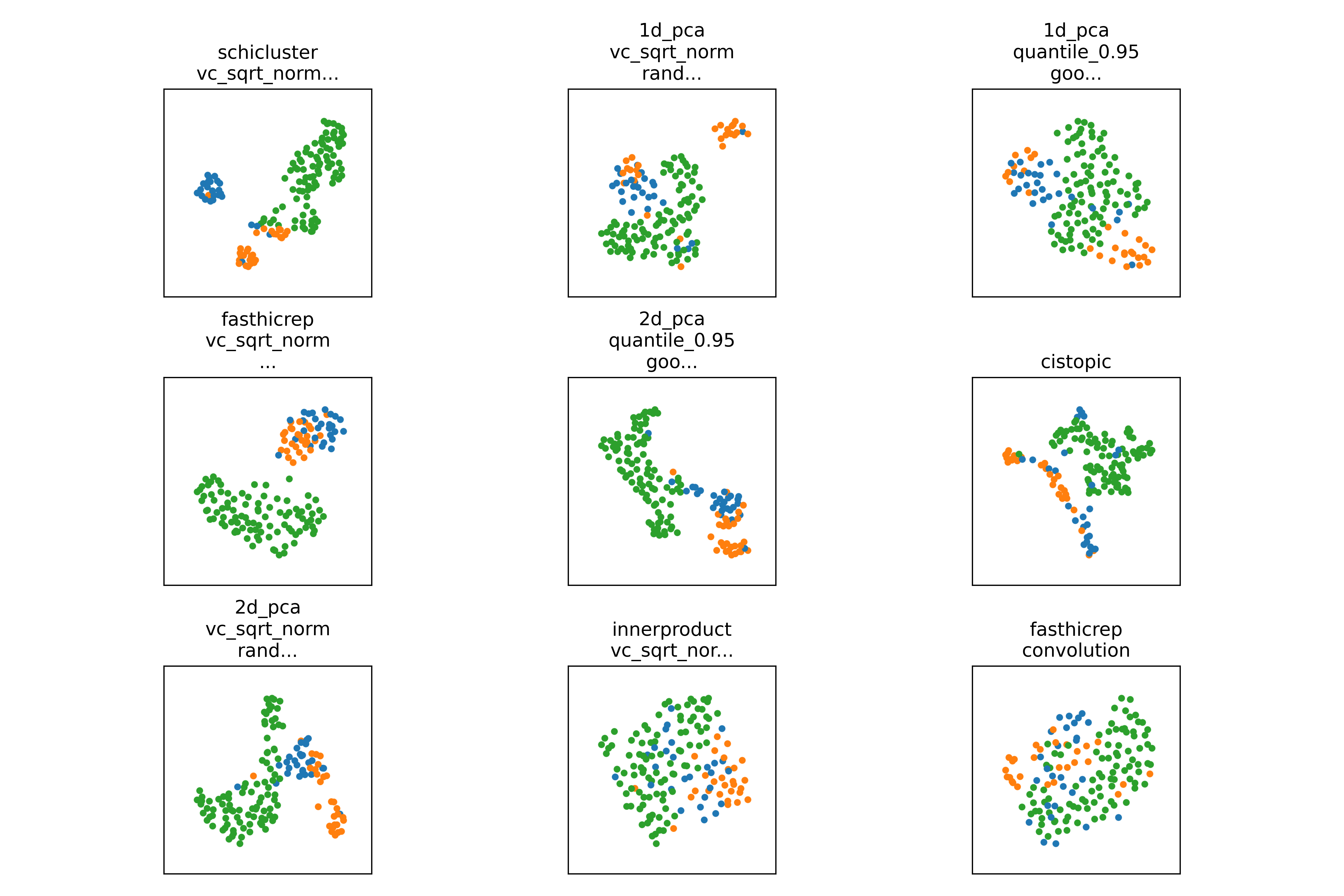
You can visually compare results by looking at the pca, tsne, and umap plots in the celltype_plots directory:
scloop will also run hypothesis testing to determine if the performance of a given method is significantly better than the baseline.
You can see the compare_to_all_effect_size figure to see the effect size of each method compared to all others:
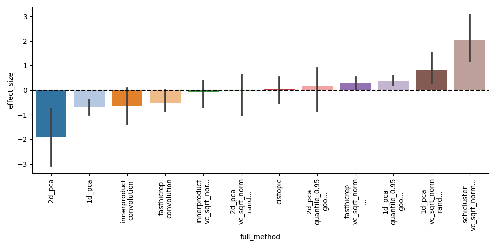
From this, we can see that scHiCluster is clearly the top performing method, but that several other baselines can perform similarly with similar preprocessing.
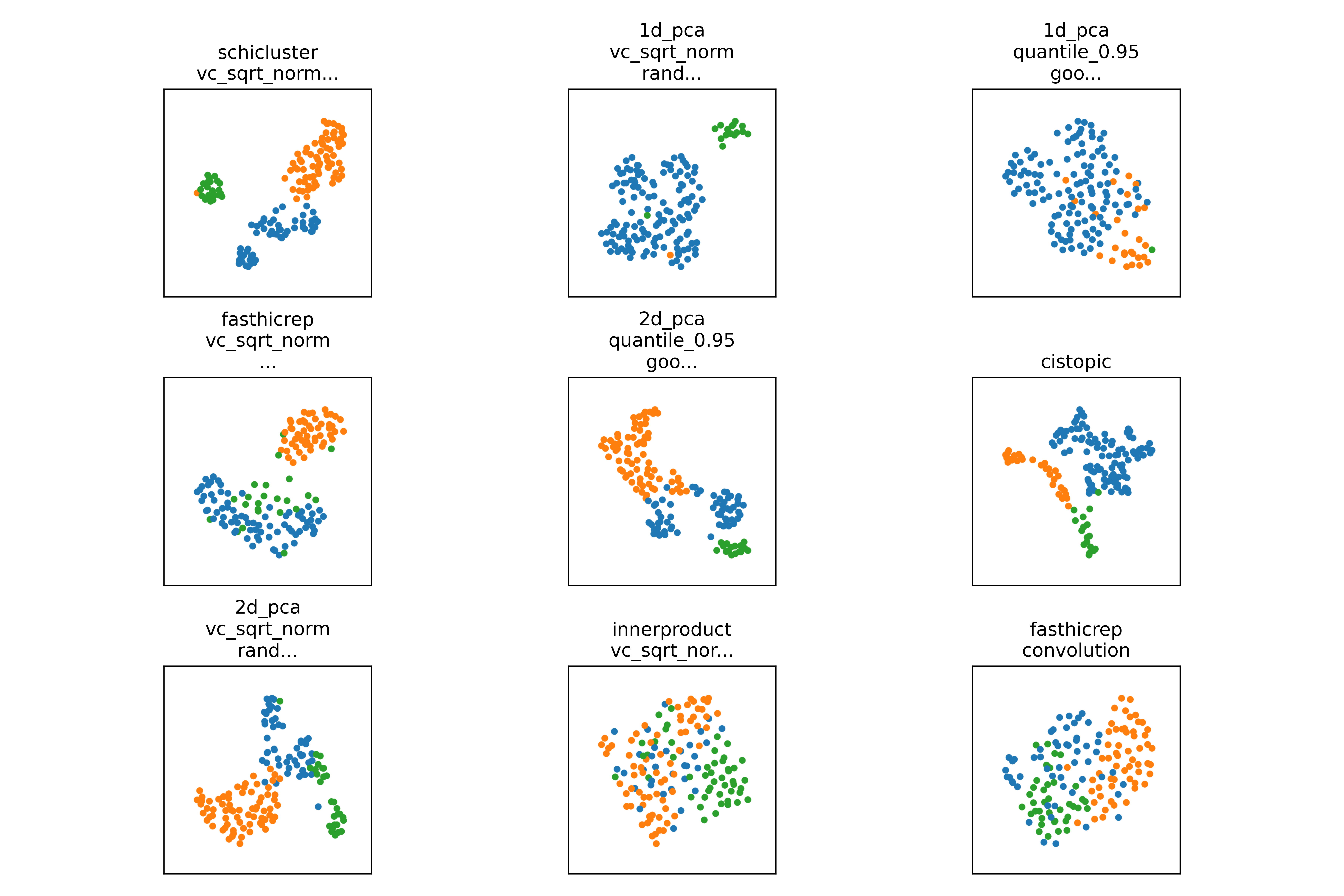
Alternatively, if you are analyzing a new, unknown dataset, you can check the results from individual clustering algorithms such as umap_agglomerative and umap_louvain to see if the clustering is reasonable.
Exploring results of a single method
After running a sweep of the baselines, we might want to explore a single method, or just a couple in more detail.
To specify a single method, we can use the --embedding_algs argument.
This argument can take a single method or a list of methods.
A single method can be specified as <method> or <method>+<preprocessing>. Where <preprocessing> is a comma separated list of preprocessing steps.
scloop embed --dset oocyte_zygote_mm10 \ # name of dataset
--scool data/scools/oocyte_zygote_mm10_1M.scool \ # path to scool file (other formats supported)
--reference data/oocyte_zygote_ref \ # reference file mapping cells to celltypes and other metadata
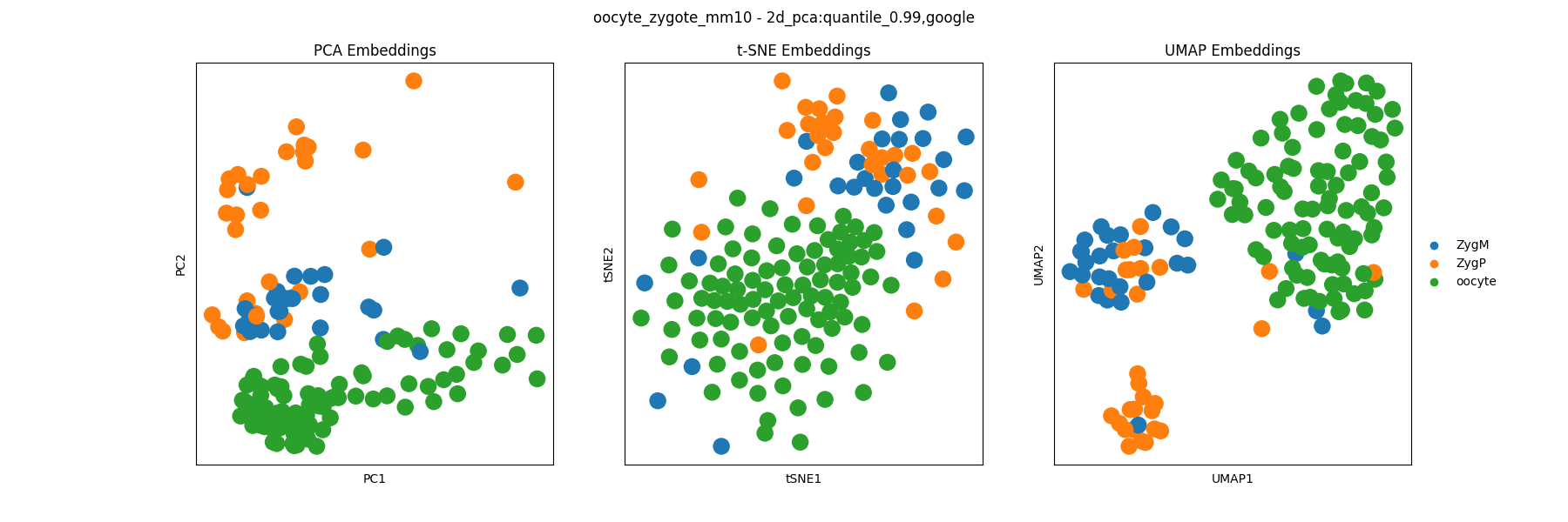
--embedding_algs 2d_pca+quantile_0.99,google # embedding methods and preprocessing to run
In the above command we run a single method, 2d_pca+quantile_0.99,google. This indicates we will first preprocess the data by
Filtering out values below some quantile cutoff
Computing the PageRank transition matrix of each chromosome
Then embed the resulting matrix using PCA. This is comparable to scHiCluster which does a similar set of preprocessing steps using a random-walk.
You can provide as many preprocessing steps as you want, and they will be applied in the order they are provided.
For information on the available preprocessing steps, see the methods section.
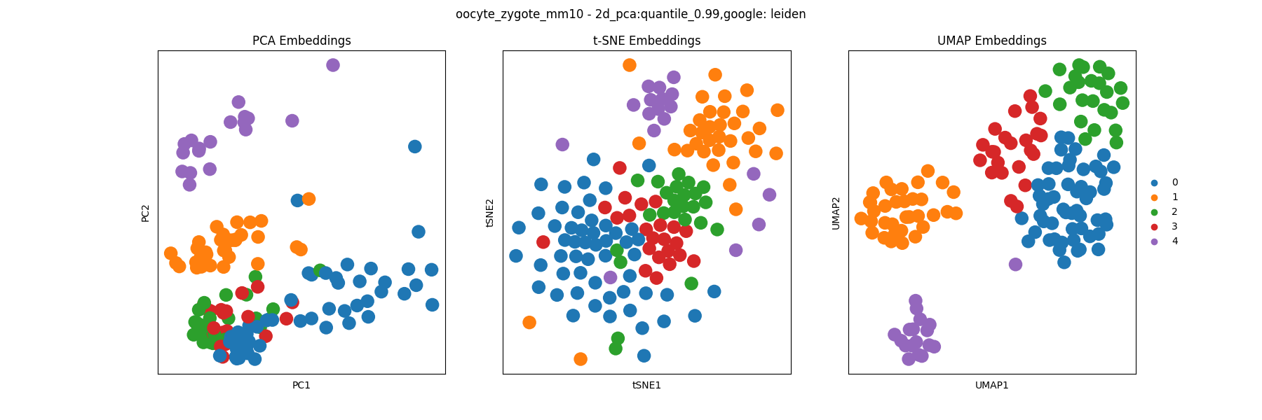
The main plot of interest in generally the PCA, t-SNE, and UMAP visualizations of the embedding colored by celltype labels which can be found in the celltype_plots/embedding files:
The clustering analysis results are saved in the clustering directory and include visualizations of the clustering assignments of each algorithm. For example, we can visualize the Leiden clustering assignments:
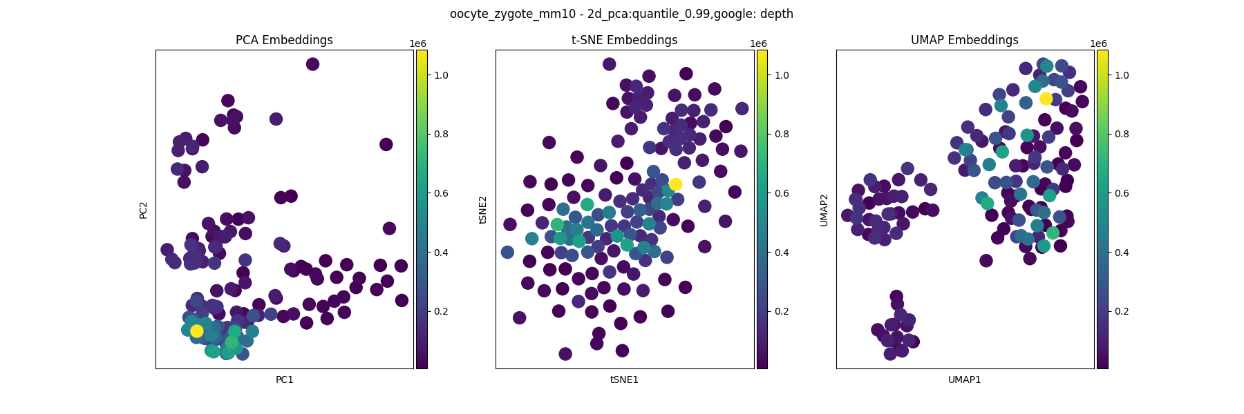
Any other metatdata that can be plotted as a categorical or continuous variable can be found in the other_feats directory. For example, to visualize the cis read count of each cell:
Using Config Files (recommended)
You can also store the arguments in a preconfigured JSON file which is typically easier to manage for more specific method options:
scloop embed --dataset_config oocyte_zygote_mm10.json
oocyte_zygote_mm10.json:
{
   "embedding_algs": [
      "2d_pca+quantile_0.99,google"
   ],
   "dset": "oocyte_zygote_mm10",
   "scool": "data/scools/oocyte_zygote_mm10.scool",
   "reference": "data/oocyte_zygote_mm10_ref",
   "n_strata": 16,
   "latent_dim": 64
}
For convenience, one of these files will be saved to the data/dataset_configs directory after running using normal CLI arguments. You can then edit this file to change the arguments and run again using the dataset_config argument.
AnnData and scanpy Compatibility
Besides visualizations, the main output file of interest will be the anndata_obj.h5ad file which contains the full embedding, celltype labels, cluster assignments, and other metadata. This file can be loaded into scanpy or AnnData for further analysis and figure generation.
import anndata
import scanpy as sc

adata = anndata.read_h5ad("results/oocyte_zygote_mm10/1M/2d_pca+quantile_0.99,google/anndata_obj.h5ad")
sc.pl.umap(adata, color=["celltype", "leiden", "depth"], wspace=0.4)
Otherwise, we also output simpler formats of the cluster assignments and embeddings separately as clusters_<alg>.json and embedding.pickle respectively.